Mobile App Design For Vehicle Maintenance

OVERVIEW
Ask a vehicle owner about the last time they took their vehicle to an auto shop & they’ll likely get excited to tell you a story about some sort of crazy experience they had. This project was designed to relieve the frustration of vehicle maintenance & help vehicle owners take care of their vehicles easily, efficiently, and with a sprinkle of joy.
Problem Statement
Utilizing a human-centered design approach, I took this project through full implementation of classic Design Thinking process.
Solution
As the UI/UX Designer, my role was to undertake user research, define the problem & come up with solutions. I then took the project through progressive stages of the product’s development, designing screens, creating prototypes & conducting usability testing.
My Role
MY PROCESS

I developed key questions that guided my secondary research and user interviews, which I used to determined the primary goals of this project.
Research
Through the use of an affinity map, empathy maps, user personas & job stories, I determined the top concerns for vehicle owners, and then figured out what the vehicle owner would expect from this product.
Synthesis
Based on the findings from my research, I summarized the key pain points for vehicle owners into problem statements.
Problem Statement
With pencil & paper, I sketched out as many ideas as possible to solve the problems, and then utilized laddering to narrow down the top 3 solutions.
Solutions
Using the MoSCoW rating, I determined what this product would & would not solve for vehicle owners.
User Stories
I created a sitemap to lay out a high-level navigational hierarchy of the product.
Sitemap
Then, I created user flows to lay out the low-level navigational hierarchy of the product.
User Flows
Before laying out what the product would look like, I chose to evaluate 3 similar products using 3 usability principles.
Heuristic Evaluation
With all user data in hand I sketched all flows for mobile and a few key screens for desktop.
Sketching
Once the sketches were complete, I recruited participants for usability testing to discover user flow issues.
Usability Testing
Based on the top findings from the usability testing, I transformed the sketches into wireframes.
Wireframes
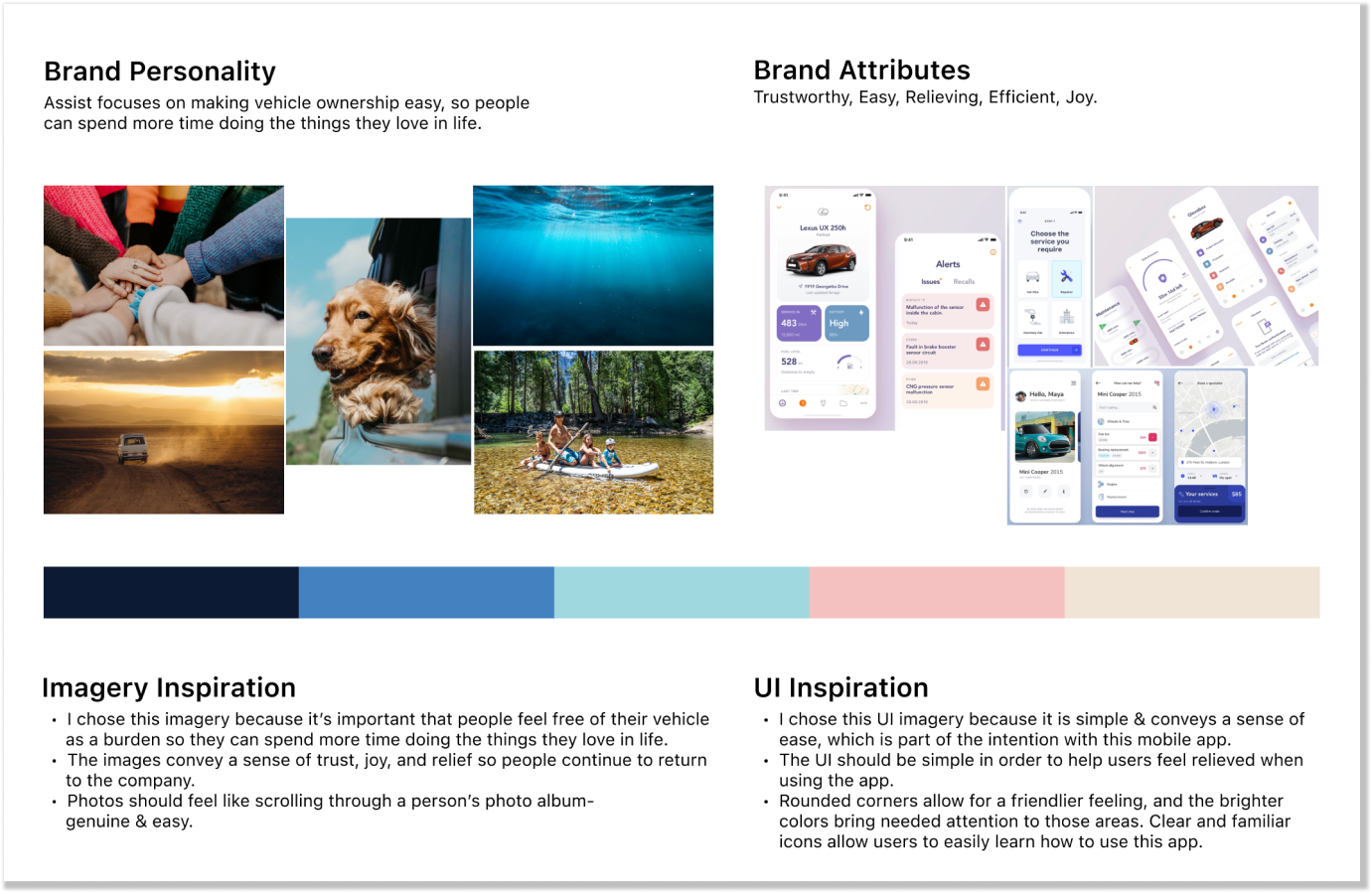
Style Guide
Then, I created a moodboard & style guide in order to create the look & feel for the product.
High Fidelity Screens
From here, I put all of the visuals & functions together into high fidelity screens.
Prototype
Then, I turned my high fidelity screens into a live prototype to prepare for usability testing.
Usability Testing
I recruited 5 participants to test my prototype, then iterated using the top findings. Then, I recruited 5 more participants to test the final prototype.
EMPATHIZE
DEFINE
IDEATION
PROTOTYPE
TEST
EMPATHIZE
Research
A Look into Vehicle Owners, Vehicle Maintenance, & Trust in Auto Service Providers
The questions guiding my secondary research were:
What specific audience is most likely to struggle with trusting their service providers & understanding vehicle maintenance?
What are the main factors causing these struggles?
How are people currently selecting service providers to work with?
How are people currently maintaining their vehicles?
What alternatives or solutions are available to solve this problem?
Secondary Research Findings:


Research Plan Objective:
Synthesis
The Top 3 Concerns for Vehicle Owners are: Speed, Cost & Customer Care

I used Miro to create an affinity map to visually see the emerging themes from my user interviews. I was surprised at how often customer care and respect were mentioned.


I originally created 1 empathy map, but as I continued to analyze the data, I realized that there were actually 2 users. I turned the empathy maps into 2 User Personas in order to better help me understand who I’m creating this product for in terms of goals, attitudes, and pain points.
Affinity Map
Empathy Maps & User Personas
Job Story

I chose to write a job story using the Jobs To Be Done framework in order to define the main tasks that each user would want to accomplish. While there were key differences between the 2 User Personas, I decided to create 1 job story that would solve the overlapping concerns of both users.
Concerned about paying a reasonable price for service
Willing to pay a premium for efficiency and trust.
Identify the struggles vehicle owners face in conducting vehicle maintenance & their dynamic with auto mechanics and provide opportunities for improvement.
Customers want their service providers to be competent, explain things, and be respected.
DEFINE
Problem Statement
Defining the Pain Points That Vehicle Owners Face

Upon reviewing the insights from my research and utilizing the job story, I created 5 problem statements to solve.
IDEATION
Solutions
Brainstorming Solutions to Make Vehicle Maintenance Simpler and More Efficient


I set out to come up with as many solutions as I could through brainstorming & sketching
Through laddering, I narrowed down my ideas to the top 3.
Upon reviewing the top 3 solution ideas, I determined that the best solution was actually a combination of the 3 ideas as an app that would:
Keep vehicle owner’s informed about the status of their vehicle’s current service so that they could make plans according to how much longer they’d be without their vehicle.
Allow for clear communication from the auto mechanic.
Show how severe a vehicle issue is so that the vehicle owners have an idea of how long the work will take and how costly it will be.
Provide the ability to schedule an appointment easily & quickly.
User Stories
Bridging the gap between user needs and the outcome the user wants to achieve

Using the MoSCoW rating, I was able to determine User Stories that this product would & wouldn’t have.
Sitemap
Laying out the navigational hierarchy of the app

“Services & Prices” will help users locate different types of services & their associated costs.
Urgent services will easily allows a user to find a same-day appointment
“My Vehicle” will house vehicle service records, current service status, and upcoming appointments. “My Account” will house basic app settings like notifications & display.
User Flows
Building out the steps for a user to take to solve their problem


Figure Out the Vehicle Issue & How Much It’ll Cost to Fix

2. Get Vehicle Status

3. Book Routine Service
While creating the user flows, I was challenged to put myself in the user’s shoes and break down each flow step-by-step. I asked questions like “If a user wants to book a routine service, what information would they need in order to be successful, and how would they input that information?”; and “What is the order of steps the user needs to take to be successful?”
Heuristic Evaluation
Similar Products are Simple & Familiar, But Have Critical Limitations
I looked at 3 products in order to spot usability issues that could occur, evaluating by: Match Between System & Real World, Consistency & Standards, Aesthetic & Minimalist Design
I chose these 3 principles due to my goal of relieving a vehicle owner’s frustration, which would require a product to be minimalist, to utilize common & easily understood terminology, as well as utilize familiar icons. Simplicity & familiarity are key here.
The 3 products that I evaluated were Carfax Car Care, AutoMD, and DriverSide. While these apps proved to be simple & familiar, there were critical limitations with each product. None of the products would allow a user to accomplish all of the user flows I had determined for my product.
Sketching
The Initial Sketches Were Designed to Keep The Product Simple & Straightforward
It was important to use familiar icons, common & easily understood terminology, and keep the product minimalist. I looked at similar flows used in existing products, specifically progress bars, input controls such as date fields, form fields, map UI patterns, product comparison, image zoom, and search fields.

I decided to use progress bars to keep users informed throughout the various phases.

Usability Testing
Putting My Sketches to the Test & Making Key Recommendations
Usability Test Goal: Seeing if the icons were easy-to-understand, if the buttons to get to the next step were in the right spot, and if users could complete the tasks assigned to them.
Tasks:
While driving Jen’s Truck, you see some white smoke coming out of the front of your vehicle. You’re not sure what’s wrong. Use this site to figure out what’s wrong with your vehicle.
You’re casually driving Jen’s truck on your way to work & you notice the oil change sticker on the windshield and see that your car is due for an oil change in just 200 miles. The only time you have available to get an oil change is Saturday afternoon. Find out how to get your car an oil change.
You’re at the auto body shop waiting for your car’s oil change to be completed. An hour & a half has already gone by. Use the site to figure out how much longer until it’s done.
Top Findings & Recommendations

On the home screen, no participant successfully clicked the “services & prices” button when asked to diagnose a problem.
I recommended updating the text to “What’s Wrong With My Vehicle?” to make it more obvious that this is an issue diagnosis section.

During the book routine service flow, all participants skipped the step to select their vehicle.
I recommended making the My Vehicle button bigger & changing the text to “select vehicle”.
Participants had to click the back button several times in order to switch between tasks.
I recommended adding a bottom navigation bar for easier navigation throughout the app.
Wireframes
Fitting Elements onto the Screens, Creating Understandable Text, and Solving Error States
I used Figma to transform my sketches into wireframes. Building the wireframes allowed me to get a real feel for how the elements would look & fit on each screen. I found that some of the screens I sketched had too many elements, and some of the elements were sized too large.

I separated the date & time screens so that they would fit better on the screen. This would add a step for the user, but it would be more functional as the screens would be much less cluttered.

I included the Contact button in the bottom navigation instead of the My Vehicle button since it’s not part of the minimum viable product.

In addition to creating wireframes for the user flows, I created 3 edge screens.
Wireflows
Making My Wireframes Come to Life as Wireflows
I created wireflows in Overflow, allowing me to clearly indicate the clickable hotspots that would take users to the next step in the flow. It was here that I really started to see this product come to life.


Style Guide
Developing the Look & Feel of the Product Based on the User Research
Due to time restrictions, I did not create a design system but did create a moodboard & style guide to provide the look & feel of the product.

High Fidelity Screens
Putting It All Together Into High Fidelity Screens, and Flushing Out The Final Touches
I created the high fidelity screens mainly utilizing the primary color- Bdazzled Blue. I designed the screens with simplicity in mind to help users feel a sense of relief, efficiency & ease. Each screen is simple, straightforward and decluttered. The product follows a step-by-step format of questions that lead the user to a solution.

I decided that the time options should be a popup scrolling menu at the bottom of the screen to be more in alignment with iOS design guidelines

I made all clickable text blue, as once the text was clicked it would turn a blue bold so it looked much cleaner if the text started as regular blue.


Since there was a lot of information on each screen, it would make them seem cluttered. So I made the headlines smaller, and moved them up into the top header bar.
PROTOTYPE
Prototype
Making Final Edits While Creating A Prototype For Usability Testing
Using Figma, I turned my high fidelity screens into a prototype to prepare for usability testing.


The progress circle on the screen that shows the remaining time of the current vehicle service looked much smoother when I added 3 screens that allowed the circle to slowly fill in. Though users would not be able to tell that these are actually 4 different screens, I found that it would be helpful when handing off the design to developers.
TEST
Usability Testing
Using Moderated Usability Tests to See if the Prototype Would Solve Users’ Needs
Usability Test Objective: Identify pain points that users would encounter while using the app that would stop them from achieving their goals, and provide opportunities for improvement.
In the first round, I held 5 remote moderated usability tests, each lasting about 30 minutes, including a short introduction, an interview, 3 task performances, and a debriefing.
Test Questions:
Can users identify what is wrong with their vehicle and see how much a service would cost?
Can users easily book a service appointment?
Can users quickly receive a status update for their current service appointment?

I recommended eliminating these 3 screens and instead taking users directly to the map screen, where I would add location icons for users to select a shop and see more details.
Participants got lost in the Book Service flow when presented with searching for a shop. Most participants were confused & did not know what to do.

Once clicking the “What’s wrong with my vehicle?” button, users hesitated when choosing between the Search, Browse, and Diagnose buttons.
I recommended adding small descriptive text below the Browse and Diagnose buttons to help users differentiate between the 2 options.

Participants were unsure which of the issues displayed was the most likely culprit.
I recommended altering the possible vehicle issues screen to display a ranking so that users would be more clear of which option was the most likely culprit.

When booking a service, participants hesitated when choosing between the Routine & Urgent options. I recommended removing this screen entirely as it proved to be an extra, unnecessary step for users. If users needed to schedule an urgent appointment, they would be able to see that as an availability option when selecting a shop.
1st Round Usability Testing Top Findings & Recommendations
2nd Round Usability Testing Top Findings & Recommendations
I iterated on my prototype, then held 4 more remote unmoderated usability tests, and 1 in-person. Test participants were given the same tasks to perform in order to ensure that the usability issues were fixed.


Users ultimately decided that the top issue would be correct, but still felt some hesitation. If I had time for more iteration, I would add a “chat with mechanic” option, as well as the ability to add a symptom while booking a service.
Users had trouble identifying “My Vehicle”, “Waiting Room”, and “Contact”. Most users did correctly identify these, but not confidently.
OUTCOMES & LESSONS LEARNED
Outcomes
Test Participants Wanted to Download the App
When I started this project, I set out to relieve the frustration that vehicle owners feel when faced with vehicle maintenance. At the end of this project, I created a mobile app that I feel confident satisfies this goal.
Based on the final rounds of usability testing, I found that overall, participants liked the simplicity of the app, and enjoyed the concept. A few test participants were even hopeful that this app would launch and that they could use it in the future.
The final round of usability testing resulted in an average score of 6.2/7 in agreement with the statement that “The Assist App is easy to use”.
Lessons Learned
Don’t Make Conclusions Without Evidence, and Review Work Throughout the Process
Throughout this project, I learned to not make conclusions without proof. For instance, from the user interviews, I was thinking that trustworthiness was a top concern of all participants, but when creating the affinity map, I found that only 2 participants actually stated this.
I also learned how important it is to review previous stages while working through the design stages. For instance, while creating the first sketches, I had to look back at the sitemap & user flows that I had created in order to stay on task and not design screens that were not critical to the user’s needs.
If I were to do this project again, I would spend more time coming up with solution ideas as I ended up with several solution ideas that were combined into 1 solution. It would be nice to have a larger variety of solution ideas to show next time.